Onboarding for a mobile game can be both simple and tricky. Whenever you acquire a user from a UA video, all of the users already understand what to do and most of them already understand how to do it. So, they can jump right to it. That way, it is simple. The tricky part can be guiding the player to new mechanics, introducing gameplay depth, and introducing new rules in the game.
Some common ways to do such is to use arrow pointers, target pointers, small texts, etc. While it does the job, can we improve it, and is it worth improving?
Onboarding can be thought of not just as a learning phase for the player, but also as a discovery phase. It’s not about just teaching the player but letting the player discover the game. As a developer, our job is to help them in the discovery process. The tutorial with texts and instructions can break the flow of the player and force them to read and make sense of the text and then relate it to the game. But when the tutorial is embedded in the gameplay it helps the player get into the game in a deeper way. Of course, it does not mean that using texts and indicators is bad. It just means that if possible, we should find other ways to make the tutorial less visible.
Short texts
If required, putting a short text at the start is good. But we have to make it count. If we need more words, our aim should be to reduce the number of words using other aids that can communicate what the word says.

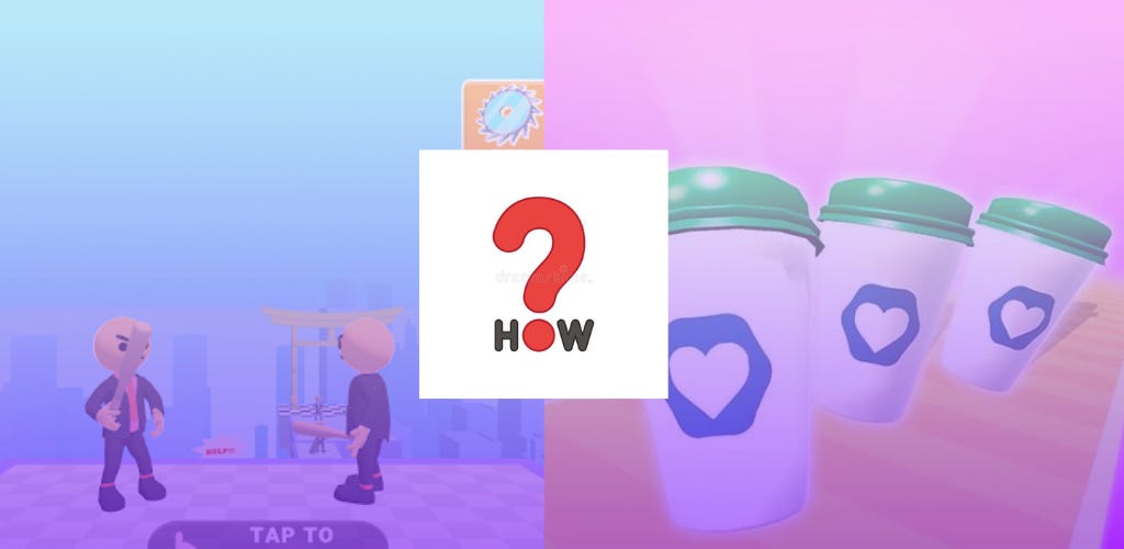
We could have shown a text that says, tap on the enemy to shoot at them and a target UI that points at the guy in front. But that gives users more to process than necessary.
So we show a text on the UI before the game starts, which conveys the game rules with simple 3 words, ‘Tap to Shoot’ and a guy that’s threatening to cut off the player’s throat. That clearly says that he is the enemy. So we essentially cut off the need to add targets, or additional texts by using a threatening animation.
Then they tap on the enemy to shoot the disc towards them. Pretty straightforward. Sweet and simple.
Forced action
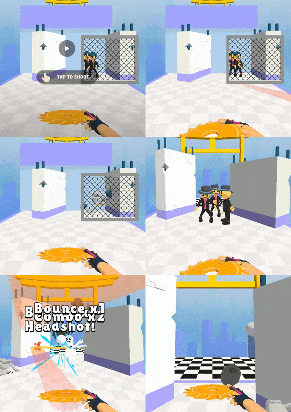
We focus on introducing new gameplay.
Throw disc to bounce off walls
First, we have enemies who are behind a fence. The player tries to shoot toward the enemies but naturally, the disc doesn’t go through as it is blocked by the fence. The player understands that. They notice the tilted wall and figure out that throwing the disc towards the wall could change the disc’s trajectory towards the enemies. They do just that and they succeed. On the next platform, we presented some walls for the players to reinforce their discovery. No target icons telling them what to do. Just forced gameplay that keeps their focus on the game and lets them discover the game by themselves. That makes them feel smart and gives them the satisfaction of the discovery!
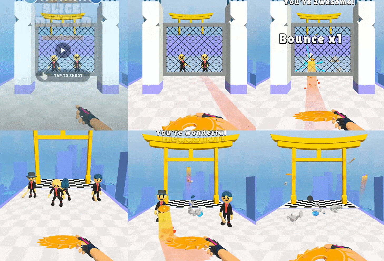
Throw disc to bounce off the floor
Similar to the previous one, we block the users to access the enemies in any way other than our desired one. This makes the player throw the disc the only way they can to discover that they can also bounce off the floor. Then on the next platform, they automatically do that
What we are doing in these scenarios, is we are blocking off the player to do any other thing except the thing we want the player to do. We are giving clues to the user by either presenting them with walls nearby or putting gaps below the fence for the players to shoot through. This way, they are discovering the process themselves.
We have tried AB Testing this way of onboarding with a different variation where everything is the same as it is above, but we also added a target indicator on the places we want the player to shoot. It caused the ARPU (Average Revenue Per User) to go down by a significant amount. So we can understand that adding more can take away from a game. In this case, adding more took away the satisfaction of discovery
Show the goal
Let’s check out the first level of Coffee Stack taken from the gameplay video from a random player from YouTube.
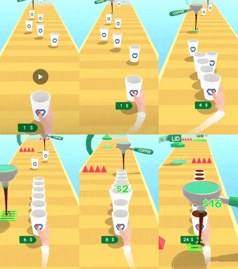
The player keeps collecting the glasses at first but avoids the coffee the first time for some reason. But after that, the red spike forced the player to collect the coffee. Perhaps another way to do it or rather a way to tweak it would to be put a glass under the coffee dripper with it filled to brim and dripping from the start of the game. That environmental clue will reinforce to the user that it’s a good thing and also demonstrate what it does.
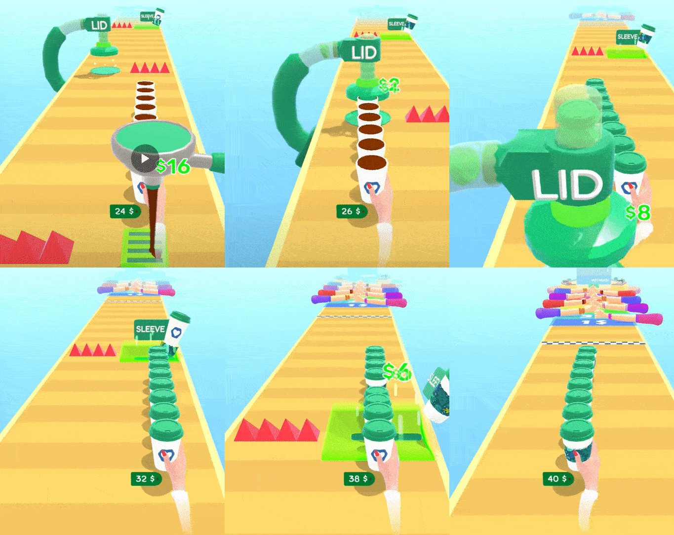
Similarly, a pre-lidded cup under the lid machine and a pre-sleeved cup on the sleeving machine could make it clearer to understand.
This is just to show a different way to do onboarding where we could show the goal and completely remove the spikes to make forced actions. By removing spikes we are lowering the cognitive load on the player and letting them focus on the gameplay actions on the first level.
The best tutorial is the invisible tutorial. A tutorial that organically fits into the game without specific instructions to players.
I am attaching a few resources which are great to do further study. Meanwhile, you can check out 4 ways to add depth in your hypercasual game


